tales of a hobby project
I have been in home office since middle of March now (as many of us…). Not much to do in my spare time, so I figured I might try out, experiment and learn a thing or two while I stay at home. The result so far is a prototype/POC that collects Covid-19 data from John Hopkins University and visualises different aspects. On this page I summarize some of the little milestones. The code can be found on my github
25/5 Various minor changes
Throughout the past days I have mainly worked on minor changes, such as colours for different status messages, layout, removing unused code.
18/5 Asynchronous git clone
I noticed that executing the git clone command was sometimes taking a bit too long, thus blocking the UI.
I changed it using Platform.runLater provided by JavaFX. This allows long-running tasks in the background, while keeping the UI updated.

2/5 Configuration
So far I have used a hard-coded value for the directory that contains the data from github. During the last couple of days I added suppport for storing the path in a properties file, so the user can choose a path by herself.
Along with that I updated the layout a bit, so that the buttons triggering git operations are a bit separated from the rest.
25/4 Error handling
I added and improved error handling. Nice to get rid of some NullPointerExceptions and long stack traces.
19/4 Putting together the pieces
So far I have experimented with different use cases separately. During the past week, I started putting together the individual pieces of the puzzle.
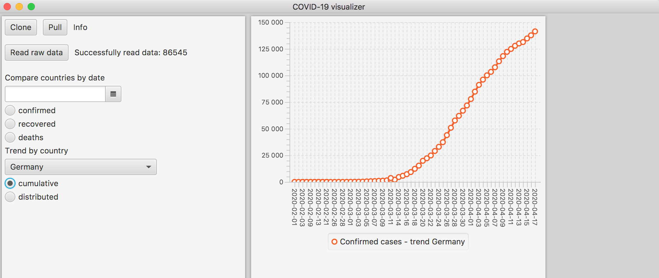
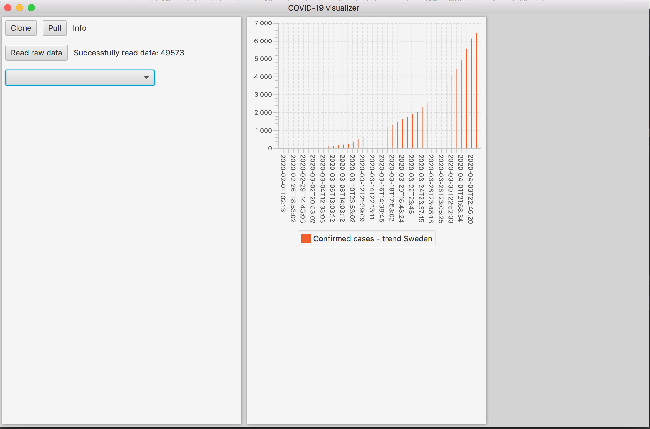
The latest feature is to let the user choose between a cumulative and a distributed trend for a specific country.
The cumulative trend shows the well-known curve that we all want to flatten.
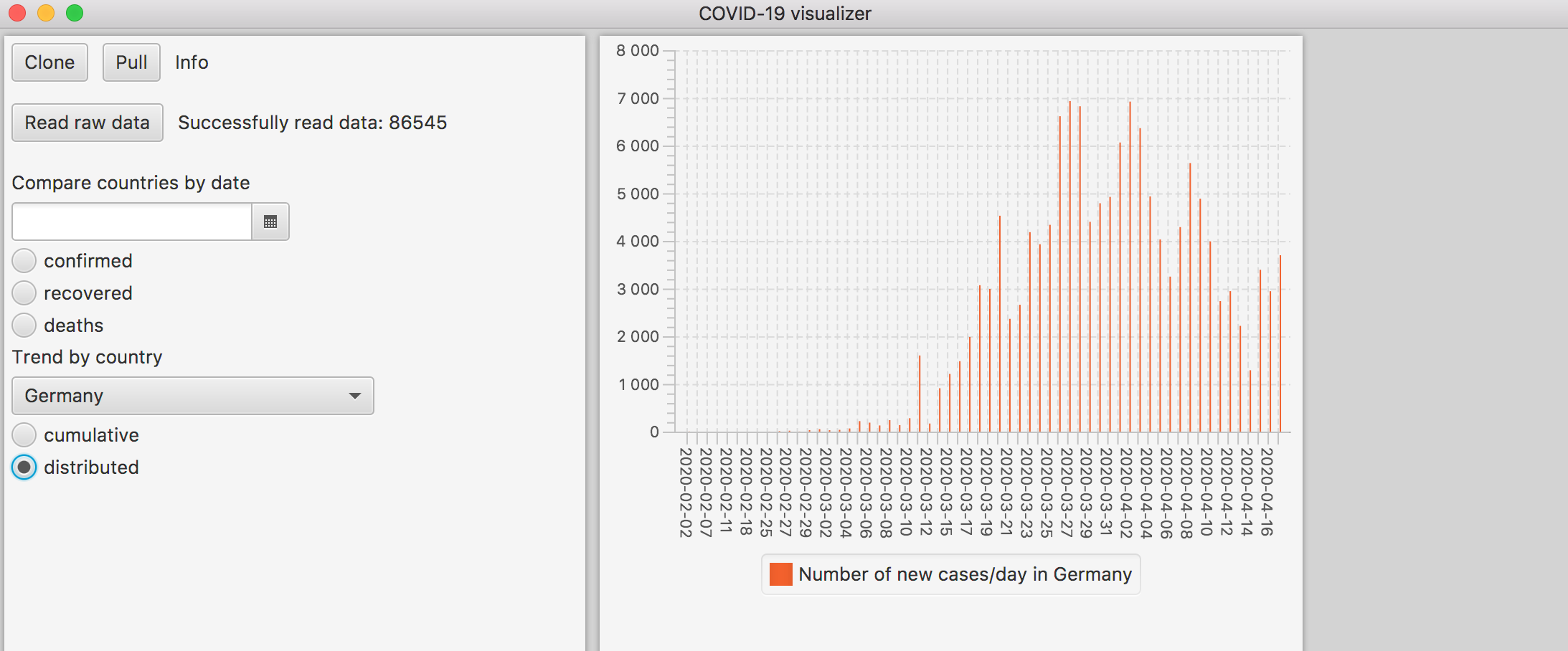
 The distributed trend shows basically the number of newly reported cases per day.
11/4 Work on use cases
For the past couple of days, I have been (slowly) working on some concrete use cases.
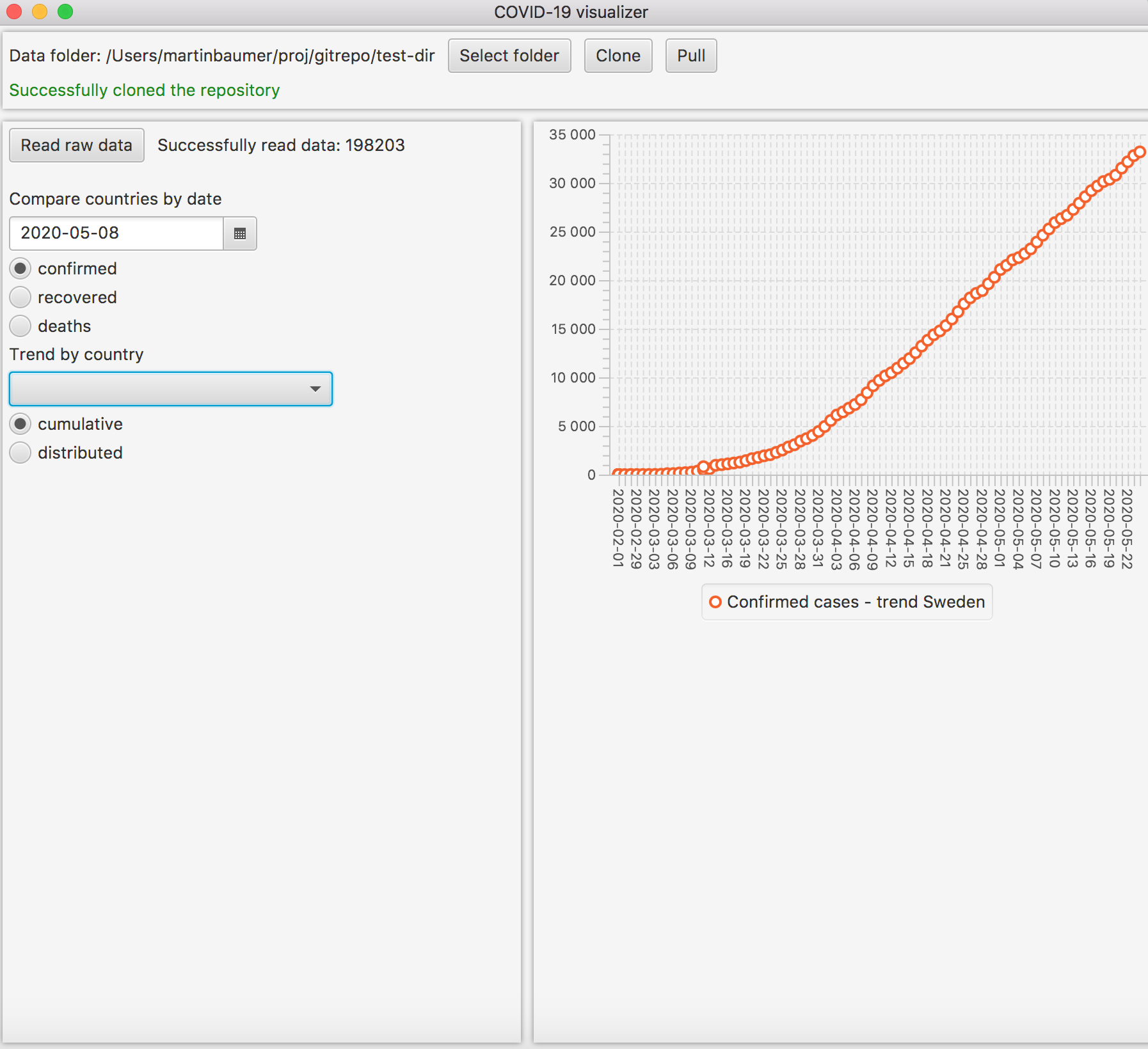
One of them is to show covid-19 data for a country that the user selects.
I have found a custom combox on github, that supports input from the keyboard. The auto-completion s not the prettiest one, but it is good enough for now and it makes selecting a country so much easier.
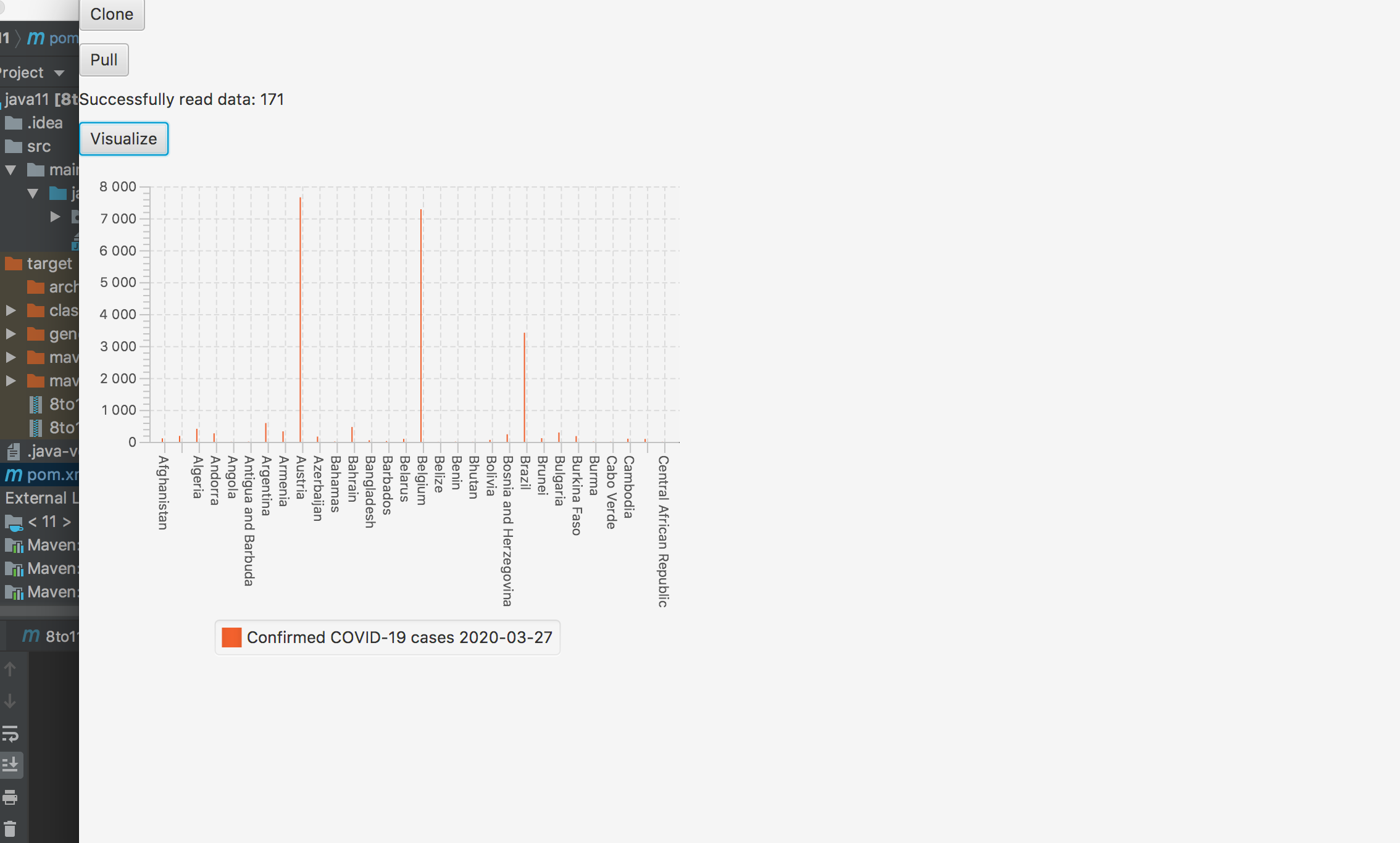
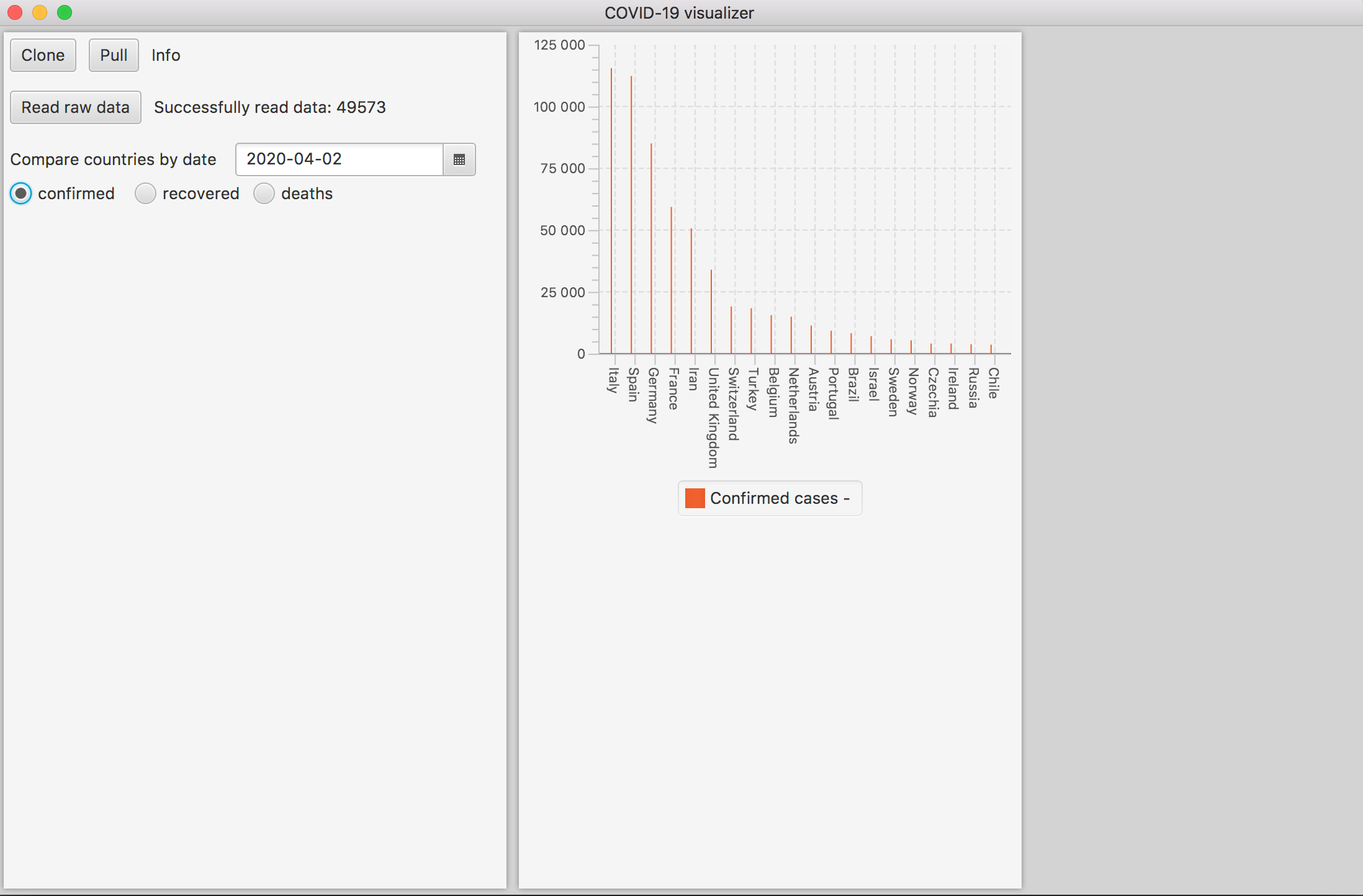
The second use case is about showing the number of confirmed cases, recovered and deaths by a specific date.
5/4 Improving the layout
I have to admit that I am not really good with user interfaces, so this little project helps me to practice. I mean if I need to stay at home, I can at least try to get out of my comfort zone for a short while!?
So after I had improved the parsing, I focused some evenings on the layout to make it a bit more structured.
2/4 Data quality
After some experiments with the data, I noticed that the data was quite varying when it comes to completeness and formatting. As a consequence, the first version of the csv parser could not handle a huge amount of entries. Hence, I rewrote large parts of the parsing to make it more flexible and error-proof. It is still not completely perfect, but there is enough data to have meaningful charts.
31/3 The beginning
While reading about covid-19, I some day found an article that was referring to a repository at github. The repository contains detailed data on the number of covid-19 cases worldwide. The repository is owned and updated daily by John Hopkins University I figured that this could be a nice coding exercise to write an application that processes the data and then visualizes them in one way or another The initial techniques and frameworks are:
- JavaFX 11: JavaFX is not te most fancy way to build user interfaces, but I always wanted to try its charting features
- JGit: a library for executing git commands
After two days of coding and experimenting, the first screenshot shows a first graph with the number of confirmed cases for multiple countries on a specific day